PORTFOLIO
Take a peek at some fun brand cards, illustrations and flyers I’ve created for my awesome clients!
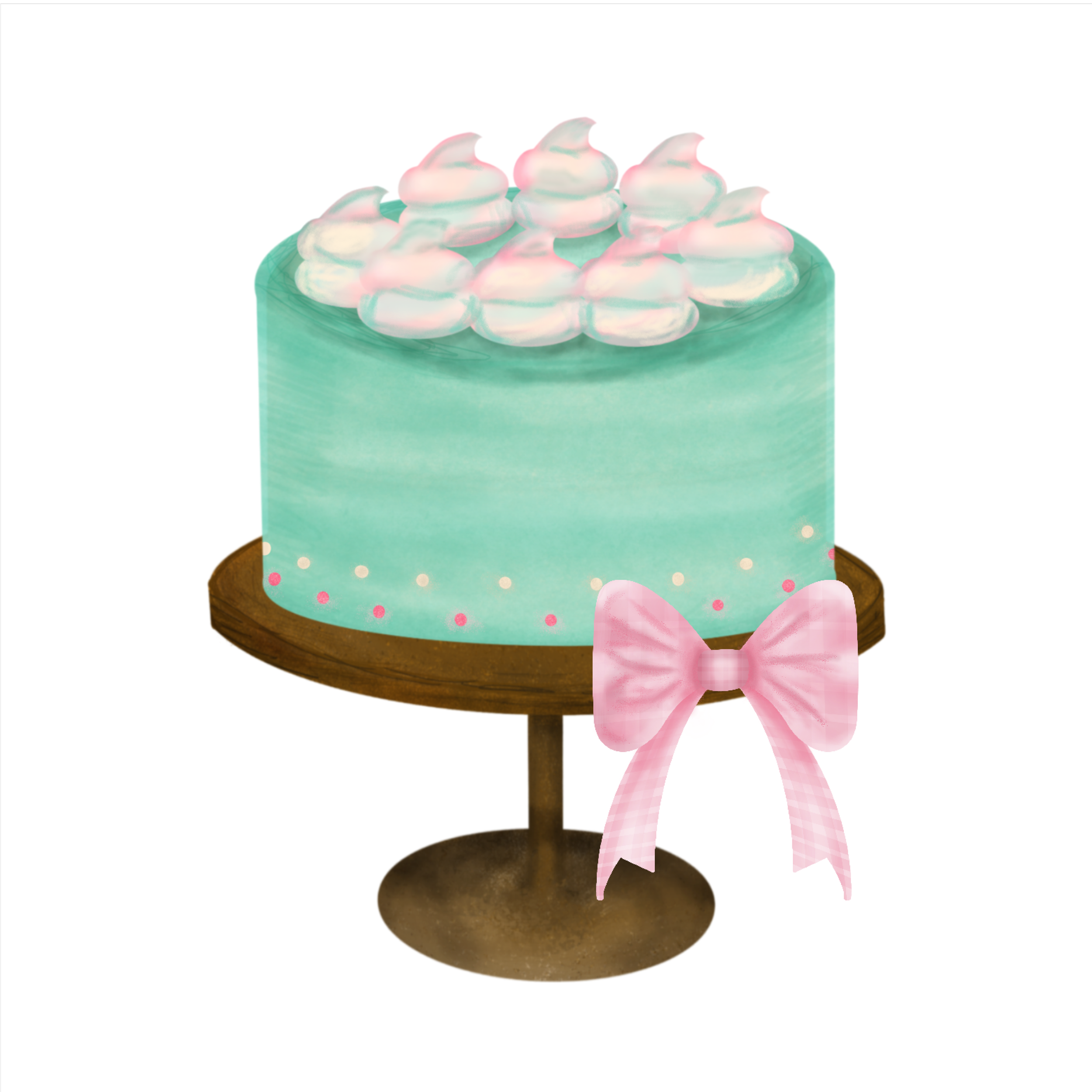
Danicia Lee-Hanford specializes in custom handheld confections such as cake sicles, cake pucks, cupcakes, cookies, brownies, and chocolate-dipped fruits. She also creates customized cakes that are fun and have interesting flavors like maple chai or peppermint patty. She loves to take events that are already special and give them an extra sweet pop. Her motto is, "A little bit of sugar makes everything better." My client wanted a mature girly design, light pink shades, pink gingham, and colorful sprinkles incorporated in her branding.
My client Martita runs two businesses: she is a beauty consultant for Mary Kay and a Mid-Life Transition Coach. My client wanted a logo design that featured feminine and soft shapes, like circles, and vibrant colors to represent the colorful aspects of life. After brainstorming, I came up with a design that is simple yet lively and immediately catches the eye. The round shape of the logo represents the idea of life coming full circle, and the colors depict the changes we go through. When you combine all those colors, they create a beautiful rainbow that represents your unique story.
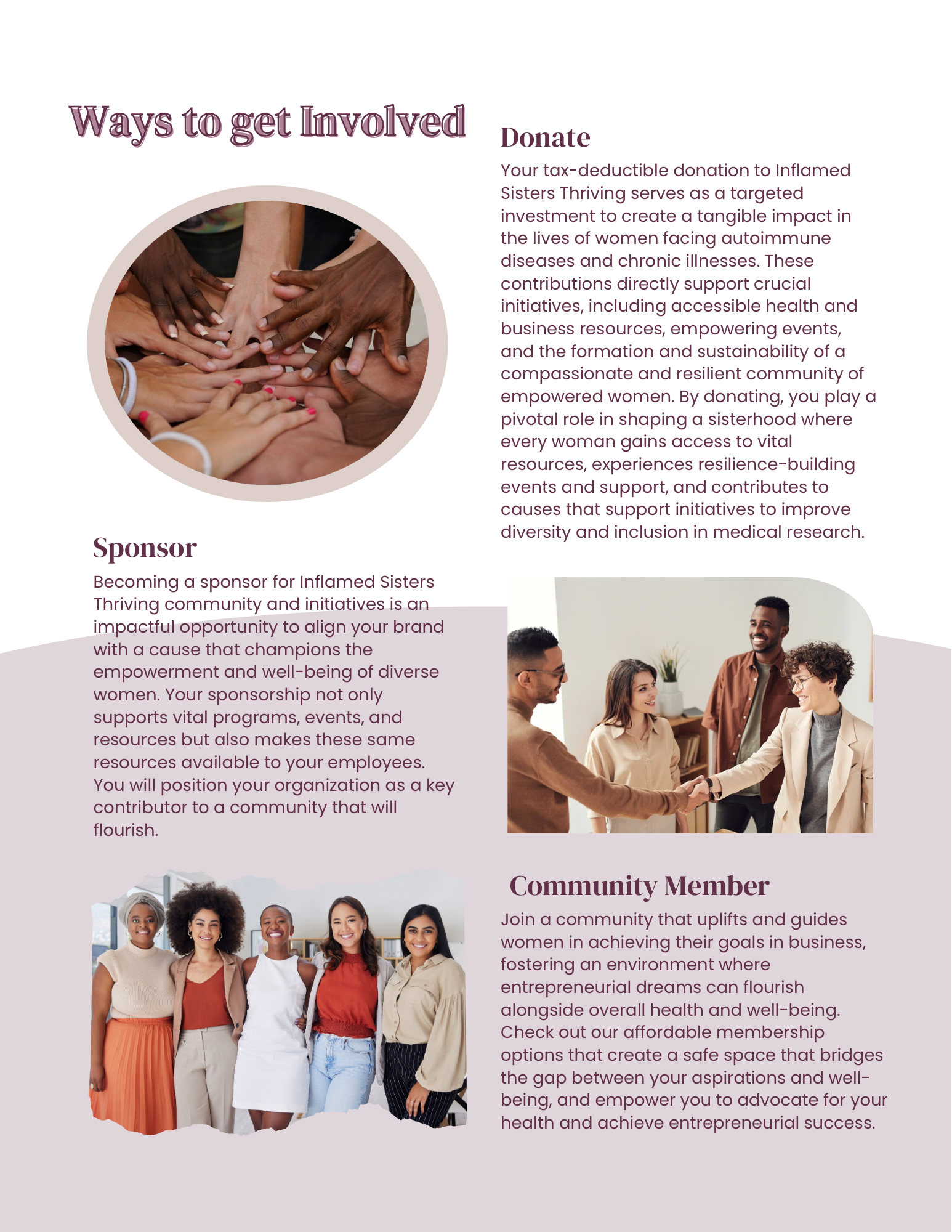
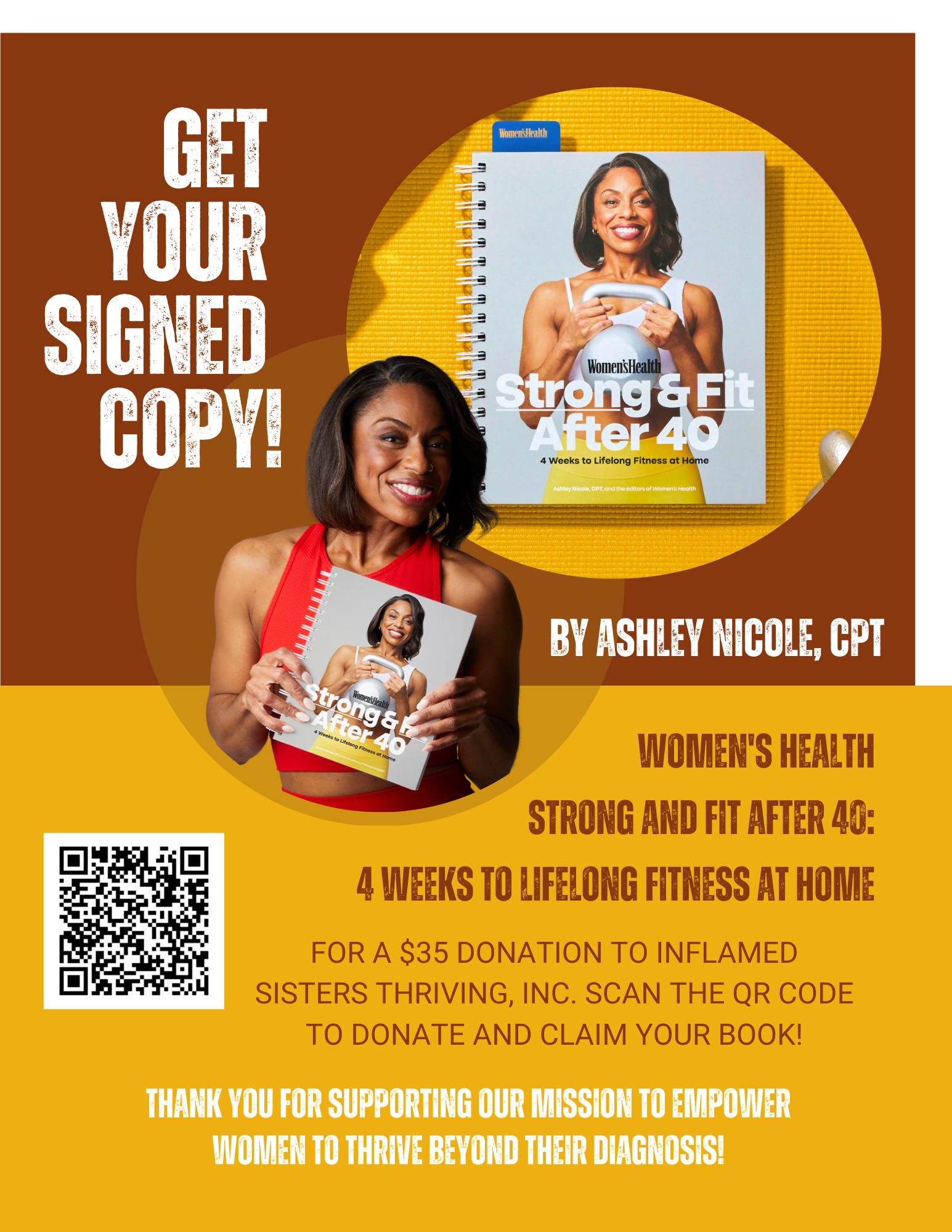
Catina Morrison, from Nurse Loves Essentials and Inflamed Sisters Thriving organization, needed to rebrand and align her logo designs with her new branding guide. I updated Nurse Loves Essentials with a sleek and modern font and added a soft touch with a stethoscope and heart. For Inflamed Sisters Thriving, I added flames over the letter "i" and created a unique design with a classy thin to medium font.
Natashia Williams is the proud owner of Ntegrity Financial Group. She holds an MBA in finance and is devoted to empowering women and young individuals by offering them financial literacy training, advice, and consulting services to help them create generational wealth. Recently, she decided to rebrand her business, and I assisted her by designing a comprehensive brand guide, color palette, and logo that can stand out among other financial groups in her field.
Amanda Whiting is committed to advocating for Rheumatoid Arthritis (RA) awareness. She aims to incorporate the powerful colors associated with RA—indigo blue and various shades of purple—into her vision. Her logo will boldly encourage everyone to use joy as the ultimate weapon for healing. We have confidently chosen to feature a butterfly in the design, as it beautifully symbolizes the ability to transform and rise above life's challenges.
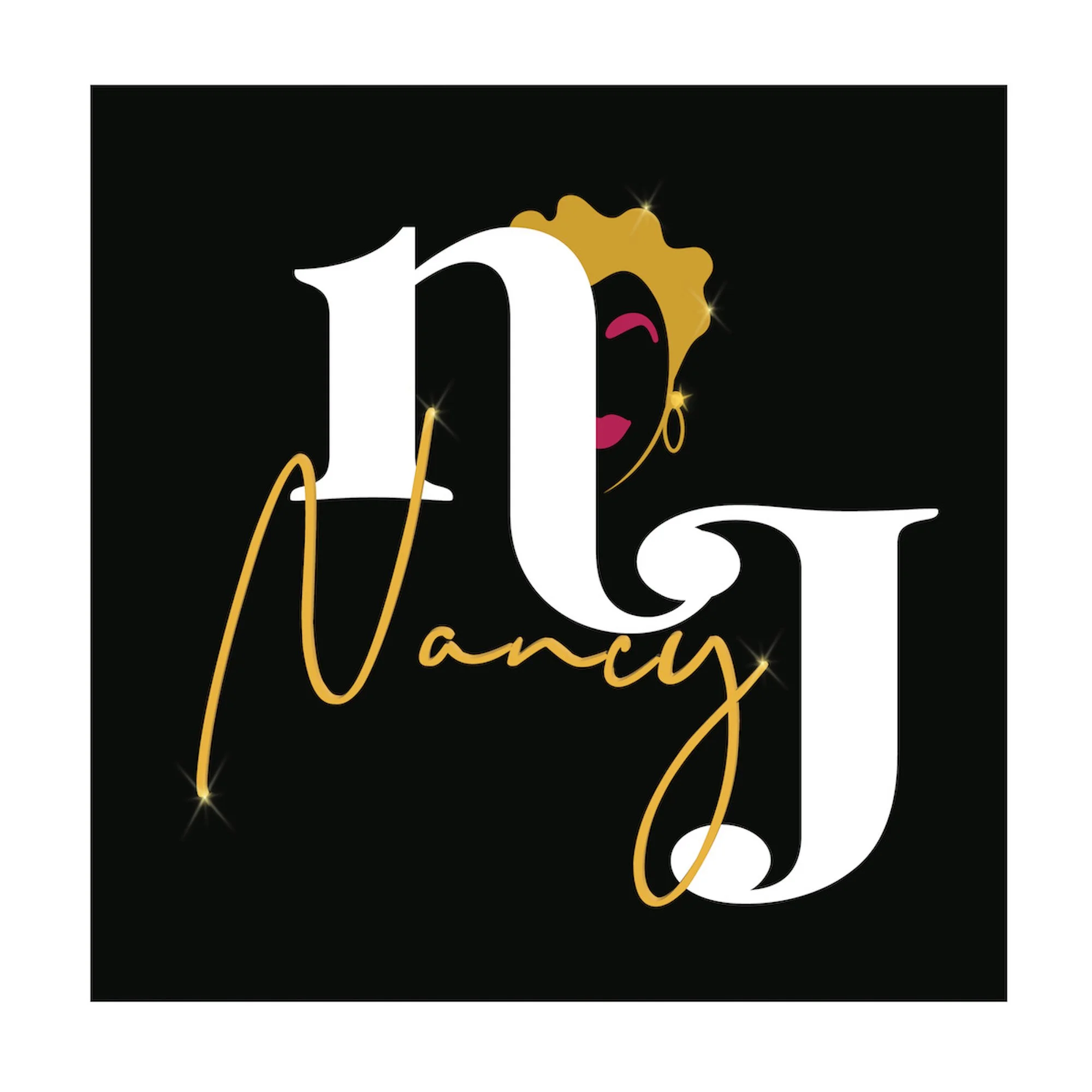
Nancy J is a highly experienced Master Cosmetologist with more than 30 years of experience. She is looking for a modern, playful, and luxurious logo for her new product line. Nancy desires her logo to resemble a picture of herself. I created a sketch of a lady wearing earrings, sporting a sassy short haircut, and fuchsia lipstick. Nancy wanted a balance between cursive and print font. The new logo, brand kit, and mood board effectively capture her identity as a woman and a cosmetologist.
KurrencyKidz Inc. Foundation is committed to promoting financial literacy and empowerment in our community. We are seeking support for our Financial Literacy Empowerment Program, which aims to develop a financially savvy society. Our goal is to instill financial competency from an early age and assist young people in making informed financial decisions that will benefit them throughout their lives. The brand design for Kurrency Kidz is inspired by the founder's grandson, King, and the spirit of Toys R Us.
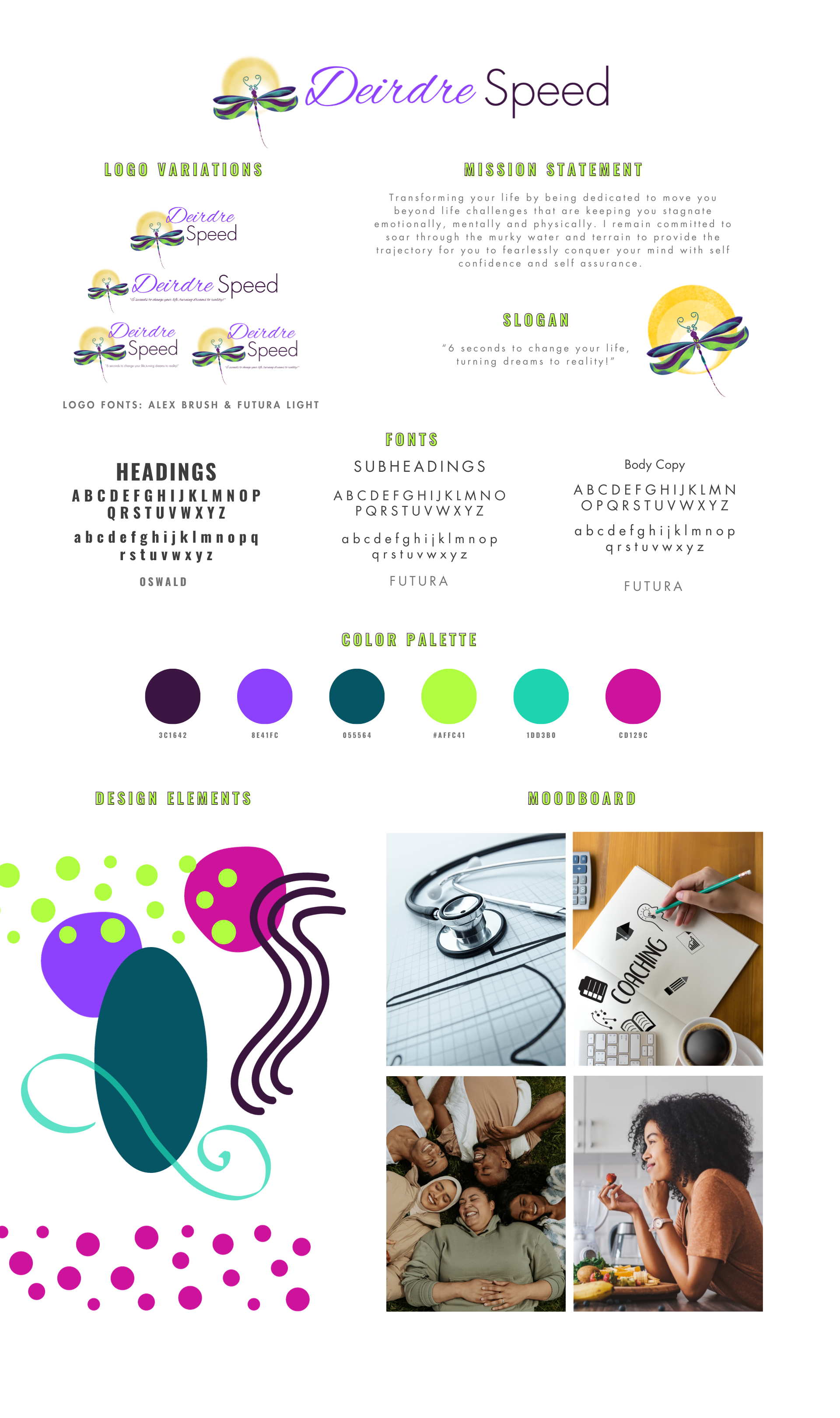
Speed Health & Wellness aims to educate and inspire individuals through vendor shows, lectures, and personal consultations as I build my clientele. The name reflects a journey, symbolizing the path each person takes in their health journey while looking towards a brighter horizon. The brand embodies a variety of bright colors such as green, blue, and purple.
Shambray Studios' mission is to capture the most precious moments in your life in an authentic, natural, and beautiful way. They specialize in family, lifestyle, and maternity photography. They wanted a brand thats feminine, classy, and masculine.


